Skip navigation

Category Archives: diagrams & graphics

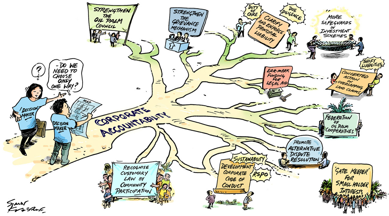
Rapid appraisal of emerging issues in the oil palm sector in Palawan Island (The Philippines): Environment, livelihoods and corporate accountability, was a scoping report produced by a collaboration between Palawan State University and the Stockholm Environment Institute. It aimed  ‘to feed the ‘rich picture’ that emerges from the preliminary results back to people in Palawan’.

As part of the feeding back the results these three diagrams were developed to be used in presentations. There was a lot of ‘rich picture’ to juggle onto each page.

Oil Palm pic A

When the pic

Pathways pic B


Two posters designed for the South Australian Electoral Commission to explain how to vote in the upcoming state election. The posters are designed for voters who are unfamiliar with how the process works or have limited English. Originally it was intended that the posters would work without any text however some words were necessary to help make the process clear. One of the posters has been adapted for remote communities where Electoral officials are flown or driven in, and it has been translated into the Pitjantjatjara language.

EC LR poster

Pitjantjatjara A4 LRjpg

Sign Low Res fileThis is a mock-up of one sign to be on a forest and discovery trail at the Tat Kuang Si Bear Rescue Centre, near Luang Prabang, Laos. The wording will be translated into Lao – and other languages.

Here is a whiteboard style animation for Aspen Medical, outlining their Corporate Social responsibility (CSR) programs. It is almost 5 minutes long – which is quite long to hold a casual viewer’s attention (the animation is aimed at new staff members).  The animation has also broken down into five ‘chapters’ for added versatility.


id Informed Decisions are the Australian and New Zealand ‘population experts’ providing demographic profiling and forecasting:  ‘We believe that by making demographic information accessible to the broadest possible audience, and promoting evidence-based decision making, we are contributing to a fairer and more sustainable society’.

Their id blog has many observations drawn from a range of data. A prime source of data being the 2011 Australian Census.

Here are some of the small graphics drawn for a number of the blog posts.

The coffee economy

The coffee economy

2012 review

2012 review

Grim reaper

Grim reaper

Economic modelling

Economic modelling


Native Australian bees have blue stripes on their back ends – not yellow. Now I know!

This artwork is for a large (3m x 3.5m) panel in the Natural Resource Management’s interactive display at the Adelaide Show this week.

The display includes recordings of the sounds of various native creatures and visitors will match each sound with a creature in the picture. The spider will be tricky.

The Seven Bridges of Konigsberg is a famous puzzle. Here is a representation of the situation (without having to draw all of 1700s Konigsberg).

Is it possible to walk around, crossing each bridge – but only once?

The Seven Bridges of Konigsberg puzzle